
City of Vancouver: talkVancouver
A service transformation for vancouver citizens
Brief
A digital service redesign of the current survey website platform, TalkVancouver, to promote an improved communication experience between the municipal government and residents of Vancouver.
Role
Main Visual and User Experience Designer, Interaction Design, Wireframing, Research
Tools
Illustrator, Figma, Keynote, Protopie
Team
Project cooperated with Dalia Alahmad, Jenny Ho, John Latay, Katherine Kim, and Karen Lim
LINKS
View the Slide Deck

big picture problem
MISCOMMUNICATION BETWEEN CITIZENS AND GOVERNMENT
If the city moves forward on plans that the citizens do not agree with, but are unable to gain understanding of the residents, the council's relationship with the citizens will deteriorate, and city growth and development is stunted. In areas such as Kitsilano and Chinatown, residents are voicing their frustrations over the lack of communication and consultation from the City Council for projects that affect their neighbourhood.

Opportunity - TalkVancouver
My team and I aimed to redesign TalkVancouver’s existing platform from City of Vancouver. By leveraging the existing platform TalkVancouver, we suggested to create a service transformation of the TalkVancouver platform for citizens to reliably find information, receive guidance, and provide feedback to voice their opinions.


I have researched countries where are actively communicating with residents, especially petition websites, such as USA’s We the People, and South Korea’s The Blue House Petition. I found insights that they are both showing the progress of the requests or opinions, and clearly show the next steps or the further requirements that would be needed in the future to apply on our product.
This large variety of precedent studies helped on finding insights on how public websites are handling and accepting wide range of different users, and how process are handled depending on different situations, or different users while reducing uncertainty but creating the trust through strong UX design with strong visual guidelines.

Measuring Success
Success of this solution can be measured by three outcome levels. First, that residents of Vancouver would be able to voice their opinions and concerns with greater confidence, due to the increased accessibility, guidance, and support from our solution.
This leads to the second level, where the city council can then make more inclusive urban planning decisions since residents are more involved in public consultation. Last, that city development efficiency is increased, actively supporting a democratic community. We can measure these outcomes in a number of ways. Firstly, through increased participation and speaker sign-ups during council meetings. In addition, city developments would proceed more efficiently, measured through how much time and money is saved. There would also be an increase in heritage sites being protected, and a greater measurement of traffic (in SEO data) through the TalkVancouver platform, as residents begin to use it as a source of information and action.
Potential Audiences and Detailed Persona
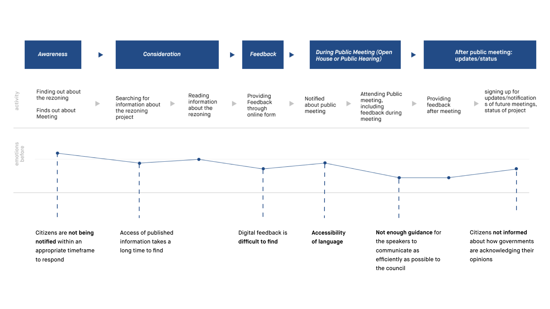
Among all possible personas that we would like to target, we focused on the Concerned First Time Speaker, who is fitting all our insights of TalkVancouver. This persona lives in the rezoning area, and is hesitating to share opinion cause of lack of information, but is desperate to talk in public for her family. After, we have narrowed down to 5 big problems that citizens were having through survey and user testing :
NOT NOTIFIED ON TIME
PUBLIC INFORMATION AND DIGITAL FEEDBACK IS DIFFICULT TO FIND
LANGUAGE BARRIERS
NOT ENOUGH GUIDANCE FOR THE SPEAKERS TO COMMUNICATE
CITIZENS NOT INFORMED ABOUT HOW THE CITY ACKNOWLEDGES THEIR OPINIONS
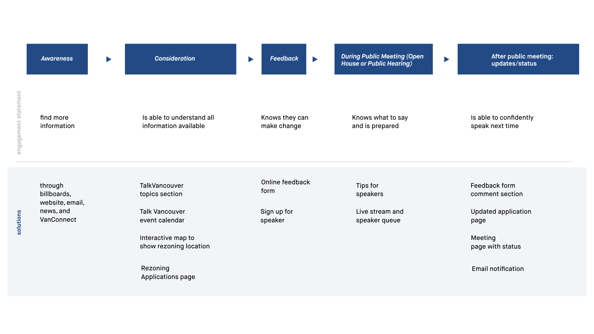
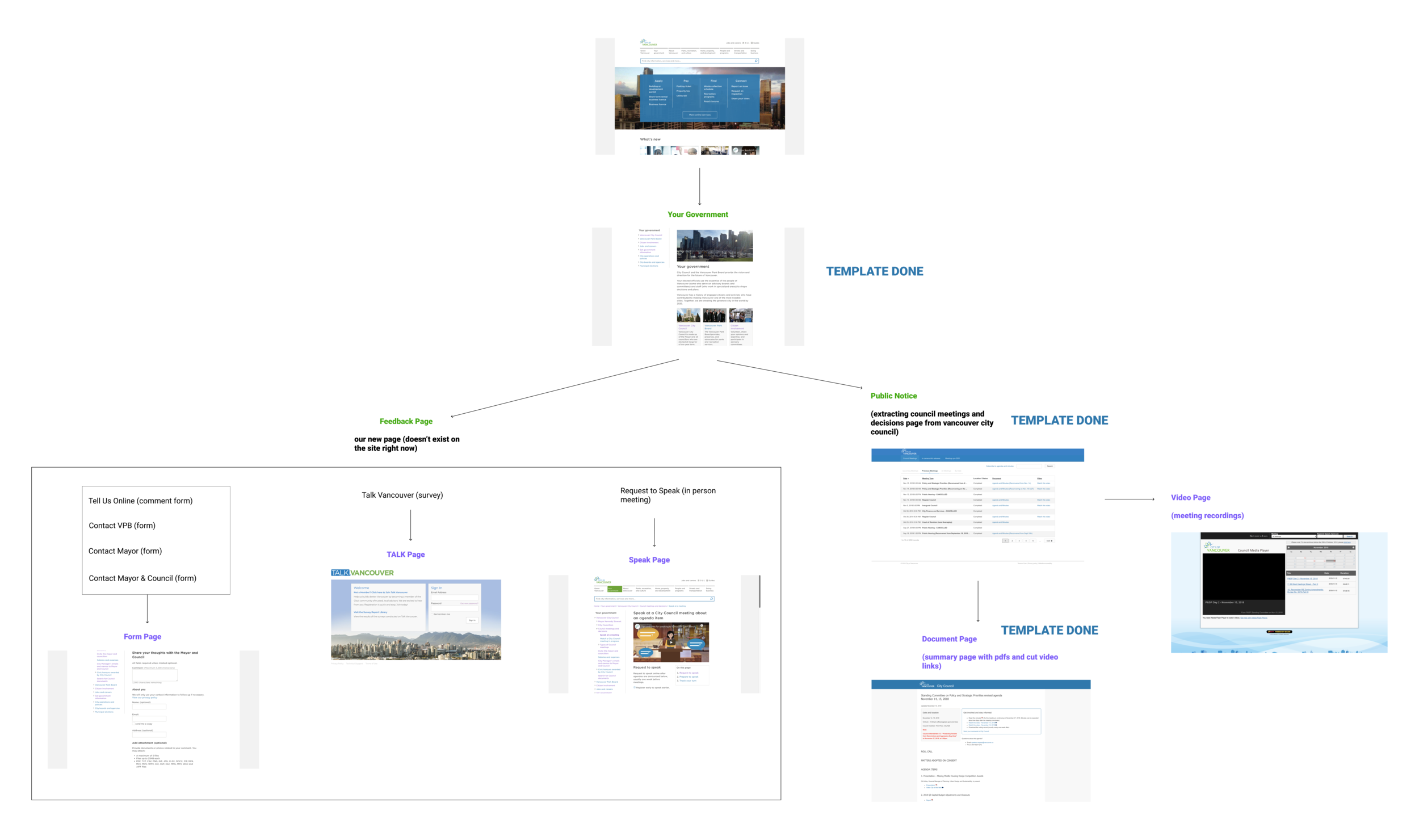
App Architecture

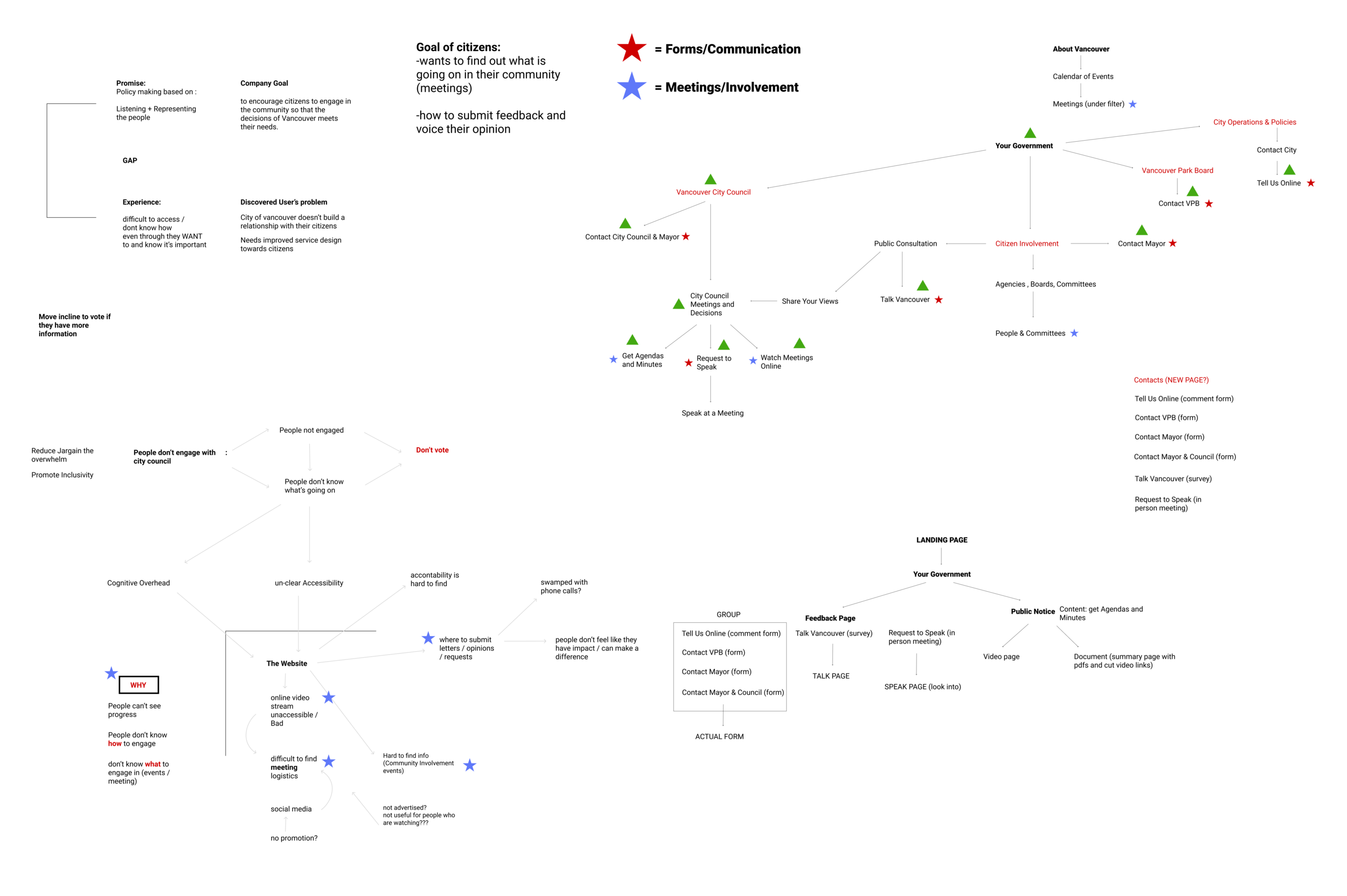
How does this solution bring clarity to the user experience?
In an interview, a city council member explained that the strongest method for change in decision or policy making is when a resident voices their opinion in person, specifically at a council meeting. However, the user journey that a resident may take on the current website was unnecessarily complex. Many touchpoints of friction such as buried information, a plethora of links leading to different pages, and a lack of consolidation for the services and support for language and disability hindered a resident from becoming a speaker.
Our solution reduces this friction through a clear navigation, and consistent page layouts. To complement the information being presented, we immediately provided residents with possible actions that they could take in response to the content. This includes options such as allowing them to sign up to become a speaker at a city council meeting to voice an opinion, providing a feedback form for those with tight time constraints, and displaying regularly updated information cards for upcoming meetings. We also created feedback loops through email subscriptions and a status bar in order for a resident to be able to check back about the topic they’re interested in and easily find their way to information again. Our team believes that in aligning these concrete details, residents will better understand what’s going on around them and know their opinions are being heard, which create emotional clarity within our solution.
Branding: visual language and identity
As a lead visual designer of the project, I went over to empower the communication between citizens and the city council as a public government website. I focused on creating the design to be more accessible. The design followed the basic elements of City of Vancouver, and are made for bringing Joy of Use to be accessible to build up the connection to show that city council does listen to citizens.
By implying insights, I decided to provide a responsive solution due to the changing situations of touch-points. This proposal came from the main value of City of Vancouver, to provide accessible services to inform citizens, gather feedback, and encourage interpersonal communication.
Visual layout and styleguide by following accessible design rules to enhance the readability and clarify of information.


Throughout the design, the elements were used to lead and show citizens to find and clarify the information. A lot of card-stock elements are used in order to find the information, and timeline maps are used to show the schedule for citizens clearly.
drafts to final

After the user testing, we received the feedback that the current website is interesting, but less joyful to use because of the stack of information one page. To achieve our end-users’ goals, the joy of use, I redesign the page to be more engaging to use. I used timeline map with detailed information that would drag better attention while receiving the information more efficiently. More details are added to minimize the frustration and to reduce uncertainty.
Prototype
CLAIRFY COMPLICATED INFORMATION
This step is created for follow citizens to view new updates to rezoning applications upfront. Revisions to proposals are brought to the top of the page so that citizens can see new updates right away, and an email is sent to citizens to notify of these new changes. For up-to-date notifications, we chose one of emails as our first touch-point of residents and city councils.

REAL TIME UPDATES
Real time updates on rezoning processes with current statues was designed for citizens to get updated, and be informed with detailed information that are consumable.

GUIDING STEP BY STEP FOR CREATING BETTER UNDERSTANDING
This is to engage citizens in the speaking process by giving guidance for first-time speakers. Through providing information on the speaking process, as well as advice on how to best structure their presentation.

ACCESSIBILITY FOR EVERYONE
This is one of the big reasons why residents were hesitating to share their opinions and voice out their thoughts to create touch-point for rezoning processes.
By adding different language options, we are allowing citizens to have better understandings about public speaking processes


reflection
Service design was harder than I expected, even though I have designed products for senior users before. This experience of creating a service design for users required knowledge on a different range of users, and also required details on every single elements that I was creating.
The key takeaway of this project was how to scope and narrow down a project to make it more achievable and enjoyable to use. When we first started the project, we were struggling to touch every aspects of the websites and the huge tone of the information we all wanted to share. However, after getting help from our mentors to narrow down the content based on the persona’s goals, this helped use make our concept and value to our client clear at the same time.
Special Thanks To
Preston Romey
Aymen Arar
Mentors
Stevie Nguyen
Engine Digital
Scott Strathern
Dan Nanasi
IBM
Justin de Freitas
Elan Asselstine